


Here’s the number that should reorganize every campaign plan: the overwhelming majority of social media time now happens on phones. Not laptops. Not tablets with nice big screens. Phones, held vertically, glanced at in stolen moments, one thumb away from vanishing.
Yet plenty of campaigns are still born on desktops, designed on big monitors, approved on widescreen presentations, and then squeezed onto mobile as an afterthought. The result shows up in the metrics: creative that gets cropped badly, landing pages that pinch and stutter, videos people scroll past because the captions are unreadable. The audience lives on mobile. The campaign was designed for a screen they rarely use. Closing that gap is where real performance lives, and it’s less about budget than about habits.
How to Optimize Social Campaigns for a Mobile First Audience
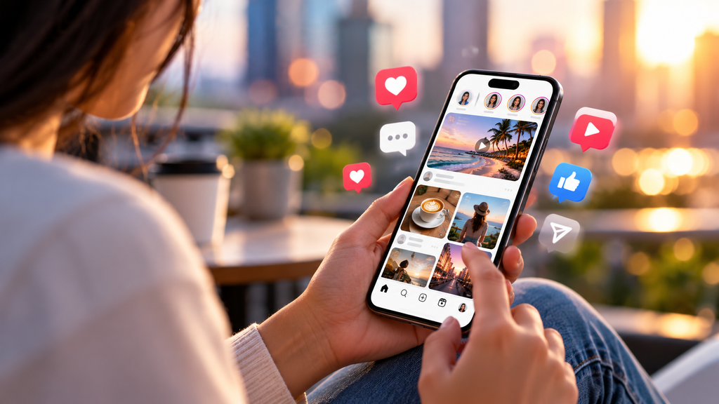
- Design Vertical Before Anything Else
The feed is vertical. Stories are vertical. Reels, Shorts, TikTok, vertical. The square post was a compromise from the desktop era, and it quietly underperforms on the screens where most people actually look.
Making vertical the default rather than the adaptation changes decisions upstream. Text sits in the safe zones instead of getting covered by interface buttons. Faces and products fill the frame properly. The crop nobody planned for stops happening. Brands that shoot natively for phones get creative that looks like it belongs in the feed, and audiences reward that belonging with a half second more attention, which on mobile is everything.
- Same Platform, Different Generations, Different Rules
One platform, several entirely different populations. A 19-year-old and a 52-year-old can both be on Instagram daily and still experience it as completely different products, formats, speeds, and tolerances for being sold to.
Aim at “everyone on the platform,” and you reach nobody in particular. What reads as authentic at 22 reads as try-hard at 50; the tone that reassures older audiences feels sluggish to younger ones. Generational research untangles exactly these splits: which formats each group actually uses, and what earns trust with whom. Same app, different dialects. So the creative, the copy, and even the posting rhythm should shift by audience. The phone experience itself is part of that: younger users live in stories and short video, and older segments lean toward feed posts and longer captions.
- Assume Sound Off, Design for It
Most social video plays are muted by default, and plenty of people never unmute. A campaign that depends on its voiceover being heard is a campaign most of its audience never actually experiences.
Captions aren’t an accessibility footnote anymore. They’re the main delivery system. On-screen text carrying the core message, legible on a small screen at arm’s length, makes the silent viewer a full viewer. The best-performing mobile video works both ways: fully comprehensible and muted, worth unmuting if the sound comes on. Test it honestly. Watch the ad on a phone, muted, in sunlight, in a scrolling mood. That’s the real viewing condition.
- Win the First Two Seconds or Lose Everything
Desktop browsing is patient. Phone scrolling is not. The thumb moves, on average, faster than any approval meeting would like to admit, and the decision to stop or keep moving happens almost instantly.
So the traditional ad structure—build context, then deliver the message—is backward on mobile. The strongest frame goes first. The hook sits in the opening line—no warm-up, no throat clearing. Whoever saves the good bit for the end is saving it for nobody, because for most viewers the end never comes.
- The Purchase Path Decides the Money
Attention on mobile is expensive to earn and easy to waste, and nothing wastes it faster than a landing page that doesn’t behave. Slow load, pinched layout, a form built for a keyboard and mouse, each one bleeds the campaign’s returns.
Check the whole journey on a real phone, not an emulator. Count the taps from ad to outcome. Try it on mobile data, not just office wifi. Are the buttons big enough for a thumb, positioned where a thumb actually lands? Every extra step trims conversions, and mobile trims harder because patience runs thinner there. Shorten three taps to one and watch what happens to the numbers. No new creative required.
- Forget Last Click, Track What Mobile Really Does
Mobile behavior doesn’t show up neatly in desktop-era metrics. Someone sees the ad on their phone, doesn’t click, and buys from the brand two days later after searching for it. Classic last-click reporting calls that organic. It wasn’t. The campaign did the work.
Widen the lens, then. View through impact. Branded search lift after a campaign runs. Promo codes unique to stories versus feed. And beyond the dashboards, watch the messier signals too: saves, shares sent to a friend’s chat, and comment threads that turn into conversations. Those are the quiet signs of consumer engagement that end up predicting revenue better than impressions ever did. Judge mobile on clicks alone, and it’ll always look weaker than it is, because its influence leaks into places the click tracker can’t follow.
End Point
The audience moved to phones years ago. The campaigns are still catching up. Vertical creative made for the feed. Video that works on mute. Hooks built for a moving thumb. A buying path that behaves on a small screen. Messages tuned by generation and measurement are honest enough to credit what mobile actually influences.
Same budget, same platforms, but finally aimed at the screen people are holding. Get that right, and the phone stops being where campaigns underperform and starts being where they win.
